Content, and by extension, content marketing, is evolving at breakneck pace. One major standout in the evolution of content is the use of visual content to brand, market, promote, and develop relationships with viewers. How can you create and use visual content that people remember, share, and click? Let’s delve into the vitals of visual content with stats, tips, and tools to ensure success.
Why is Visual Content so Important?
What was the first sentence in this blog post? Don’t cheat! Now, what was the first image? The human brain can process visual content at a rate exponentially faster than text, so it isn’t too surprising that we can remember one but not the other, particularly as time passes.
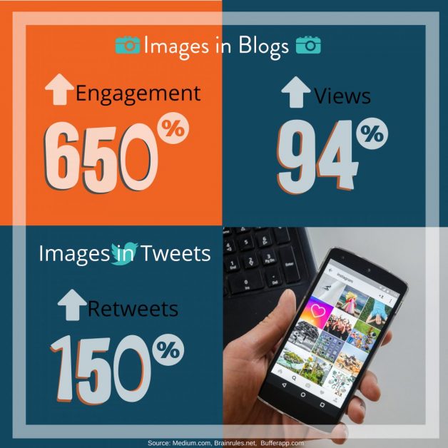
You want your posts, blogs, tweets and overall marketing strategy to be memorable and shareable, and that’s where visual content can help out. Consider just how much images can affect engagement, views, and shares.
One more important factor – when text is paired with visuals the human brain can remember it up to 6.5x better. That’s huge for branding and marketing! (Source: Hubspot).
In a nutshell, visual content creates higher engagement, more reach, and more memorable content that helps your company stick with potential customers. But what types of visual marketing content should you consider?
Types of Visual Content
If you’re thinking “how do I come up with clickable visual content on a regular basis?” don’t worry! There are tons of resources and types to choose from to create seamless content generation to complement your marketing strategy, such as:
Infographics
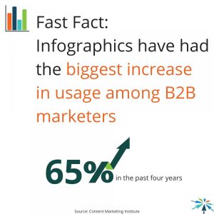
Have some stats or a few points to make? Infographics are key! Not only are you creating visual content, but you’re also establishing your credibility, particularly when you are working in a business to business space.
Screenshots
Trying to explain something? Screenshots are perfect. Use tools like Awesome Screenshot for Chrome to quickly grab, edit, and highlight important actions to make your point. It’s simple and effective, as well as providing valuable information when needed (think instructions or to convey a point). Plus, adding illustrations can help people learn more, quickly.
Creative Photos
Yes, this includes stock photos, where and when appropriate. Whether these or original photos (crowd-sourced, hired, or your own), photos tell a story about your company, people, products & principles.
Visual Notes
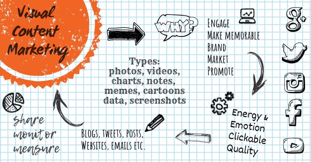
While this type of content straddles the line between visual and typography, when you have information to convey and can do so in a visual format, this works well. Or, take things a step further with a visual note video where you discuss the content while you draw it out. Even if you don’t want to “draw” your own note, you can use tools like Canva to create something with the same handwritten style.
Video
Original videos, even short ones, are a huge engager with audiences. Don’t discount how a simple video can go far. This also applies to animations, gifs, and funky app-created motion imagery. While, depending on your brand, you might want professionally shot and edited video content, your own (or crowdsourced) content can also perform well.
Data Visualization
Like screenshots and infographics, graphs and charts are great visualization tools for conveying information. Keep these types of visual content straightforward and simple. Remember, you can always link to the “nitty-gritty” numbers and details in a blog post, if needed.
Comics
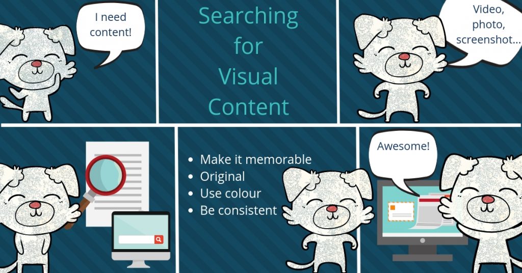
Use online tools like Canva to create original art – such as comics and infographics! Comics can be a fun way to get information across, especially if it gels with your brand.
Memes
When appropriate, memes can be fun and quirky. Be careful, though, that you don’t take memes too far, choose something inappropriate, overused themes, etc., or you might risk alienating part of your audience.
Visual Content Dos and Dont’s
Now that you know what types of visual content you can use, how do you choose the “best” content? Choosing bad graphics can harm your brand more than it helps, so take a few of these tips under consideration:
Stock photos: Acceptable, but avoid bad or obvious stock photos. Also, don’t use stock photos (or memes) that are already overused.
Energy: Avoid boring visual content. If you can’t find a good visual, then your post might not be ready to face the world. However, the energy should match the content it goes with (and your brand), so sometimes boring (or calm and relaxed) might work.
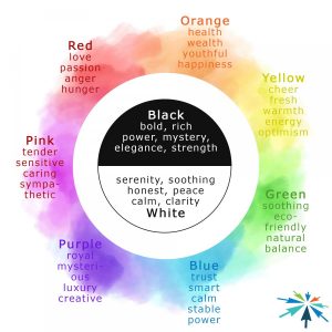
Emotion: Be aware of the emotion your visual content conveys, and how it meshes with other content and your brand. Colour can also be a driving factor in how content is received, so understand how colours are perceived.
Clickbait: Don’t post visual content for the sake of clicks. All visual content should portray your brand, not be displayed for shock value or the fact it will garner attention. This is especially true for social media where the adage seems to be “the more clicks the better” rather than aiming for your chosen demographic who is more likely to convert.
Quality: High, but not too high, or load slowly and viewers may lose interest. Crisp and in focus where it needs to be. Ensure it’s optimized size-wise for where you’ll be using it (Facebook, Instagram, Twitter, Blog, etc.) and will display well on mobile and desktop.
Finally – find visual content that has some legs! This could mean splitting an infographic into smaller chunks for social sharing, creating cartoon characters out of your staff for social posts, creating content “themes” for holidays or upcoming events, etc. You can use the same visuals for social posts, email marketing, even traditional advertising.
The more you can get out of your visual content marketing, (without overuse) the better!