Google is on a roll these days.
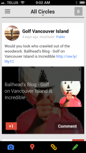
After recently redesigning the Google+ layout for desktop, the web giant has just revealed a Google Plus mobile redesign, giving the platform a new interface for the mobile web. Read official G+ Post.
Redesign Highlights
 – Posts appear as “cards” in the user stream, supposedly making it easier to read, re-share and +1 them.
– The Profile and Page experiences have been redesigned to include cover photos, larger tap targets and more.
We believe you must be in the Google spaces these days. With how they are connecting everything together, it makes more and more sense to ensure your Google+ and Pages profile and content is current, and you are paying attention to this ever evolving channel.
What do you think of the changes? Will this make you hop on Google+ more often? Does it make it easier to interact with your circles? Let us know what you think in the comments below.
About the The Web Advisors: We are a small group of professional marketers who work hard to meet client specific business goals. As every client is unique, we accomplish this task by developing and implementing the most applicable strategy. This may be by leading a website overhaul, managing paid or natural search marketing campaigns, implementing conversion strategies or training in house staff members. Please contact us with any questions or ideas you may have.