In the intricate landscape of marketing, where every detail crafts a compelling narrative, colour emerges as a silent yet powerful influencer. Beyond mere aesthetics, the psychology of colour delves into the complex tapestry of human emotion, perception, and cultural nuances. Colour in marketing goes beyond visual appeal; it functions as a strategic tool, orchestrating a symphony that can influence consumer behaviour.
Colour, chosen thoughtfully, becomes more than just an eye-catching element; it provides a conduit to evoke specific emotions and shape consumer decisions. The subtle interplay of human psychology transforms the brand-consumer relationship from a transaction into a nuanced, emotionally-charged connection. Understanding the language of colour is the key to creating experiences that captivate and resonate on a profound level.
First Impressions: The Power of Colour
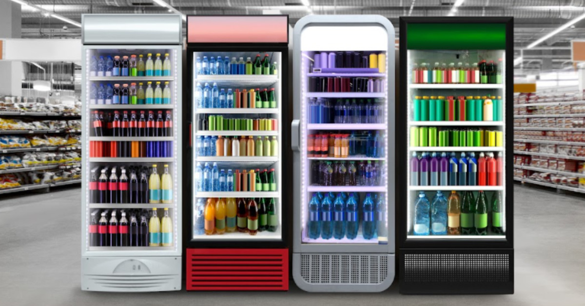
Colour plays a crucial role in shaping our daily experiences, especially when it comes to brands and products. Research shows that within just 90 seconds, people make subconscious judgments about their surroundings or a product, and up to 90% of this assessment is based on the colours they see. This quick, colour-driven evaluation becomes the foundation for the consumer’s overall experience, influencing how they engage with and perceive a brand.
Brands understand the profound impact of colour on first impressions and intentionally choose a colour palette to create an identity that goes beyond the visual. The selected colours serve as a strategic tool, conveying the brand’s personality, eliciting specific emotions, and guiding consumer decisions. Whether it’s the vibrant red of an energy drink, calming blues of a wellness brand, or sleek monochromes of a tech giant, each colour choice is a deliberate brushstroke on the canvas of consumer perception.

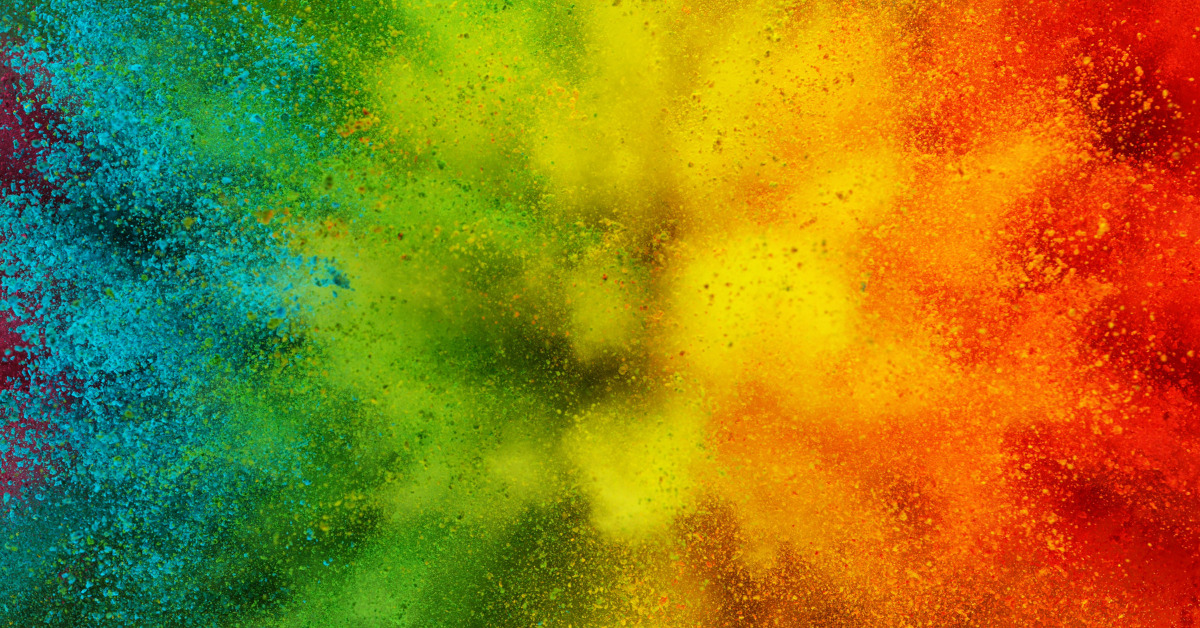
The Emotional Palette: Colours and Feelings
To understand the psychology of colour in marketing, we must first explore how the human mind perceives and interprets colours. The field of colour psychology studies the impact of different hues on emotions and behaviours. Colours are not merely visual stimuli; they have the power to evoke memories, set moods, and influence decision-making processes.
Understanding the emotional undertones of colours enables marketers to craft messages that resonate with their target audience on a deeper level. Learn a little bit about what each colour evokes (in the Western context):
- Red: Associated with passion, energy, urgency, and stimulation. It often encourages impulsive decisions and is used in clearance sales.
- Blue: Symbolizes trust, reliability, calmness, and professionalism. Common in finance, tech, and healthcare industries.
- Green: Evokes feelings of nature, eco-friendliness, tranquillity, and health. Appeals to environmentally conscious consumers.
- Yellow: Represents warmth, positivity, and happiness. Grabs attention and is often used for warnings and caution.
- Purple: Linked to luxury, sophistication, and creativity. Commonly used in beauty and anti-aging products.
- Orange: Conveys energy, enthusiasm, and friendliness. Often used to create a sense of urgency in promotions.
- Black: Signifies sophistication, luxury, and timelessness. Often used in high-end products and brands.
- White: Associated with purity, cleanliness, and simplicity. Common in healthcare, tech, and wedding industries.

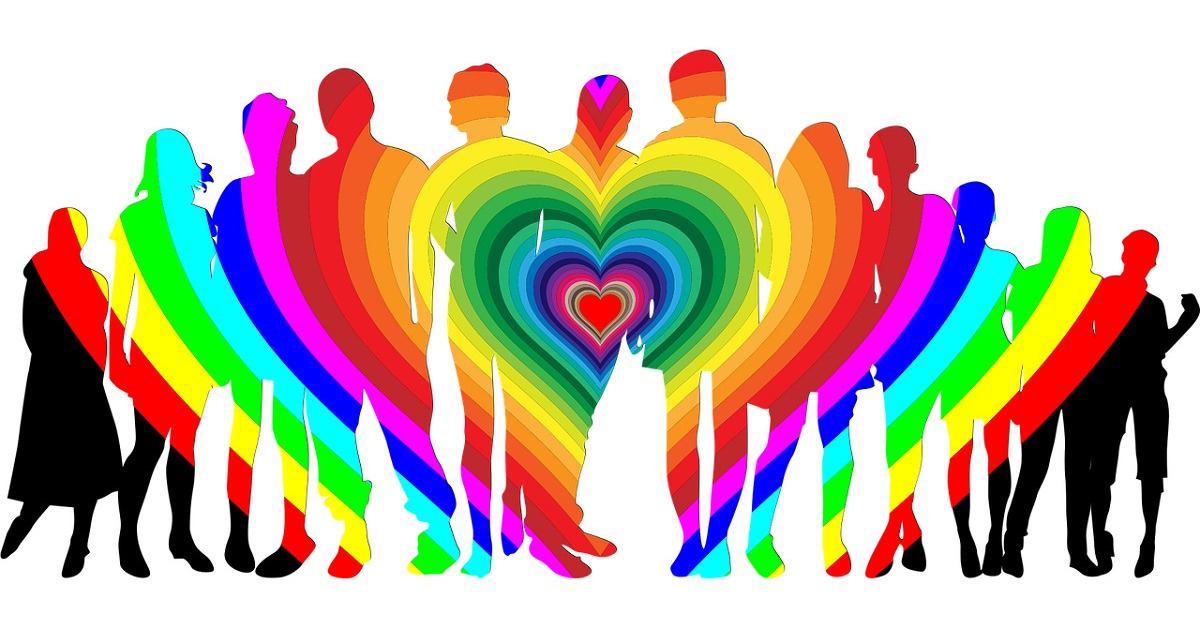
Cultural Nuances: Colours Across Borders
Colour goes beyond visual appeal; it holds deep cultural meanings that influence emotions across diverse societies. Colours, carrying cultural significance, can communicate messages that resonate emotionally, transcending language barriers. For example, the colour white symbolizes purity in Western cultures but signifies mourning in certain Eastern cultures, showcasing the importance of understanding the interplay between colour and cultural symbolism.
Brands entering the global market must carefully navigate these cultural nuances to avoid unintentional missteps. The choice of a colour palette should align with local sentiments, fostering a connection with consumers that goes beyond geographical boundaries. A successful global marketing strategy speaks the language of diverse cultures, respecting the unique meanings attached to colours across borders. By incorporating this cultural awareness into their colour choices, brands can authentically connect with consumers worldwide, ensuring that their visual identity resonates positively in every corner of the world.

Building Brand Identity: Consistency is Key
Consistent use of colour plays a crucial role in building a strong brand identity. When a brand uses a specific colour or colour scheme across its logo, marketing materials, and product packaging, it creates a visual thread in the consumer’s mind. This repetition is intentional, aiming to imprint those colours in the consumer’s memory. As consumers consistently encounter these colours, they form a link between the hues and the brand itself. This association becomes a key element for brand recognition, allowing consumers to identify and remember a brand almost instinctively. The power lies not just in the colour itself but in its consistent presence, reinforcing the brand’s visual identity and creating a unified, memorable image.
Iconic brands like Coca-Cola and Tiffany & Co. exemplify how consistency in colour fosters lasting brand recognition and loyalty. Coca-Cola’s bold use of red is inseparable from its classic logo, creating an immediate connection to the refreshing experience the brand promises. Similarly, Tiffany & Co. has turned its distinctive “Tiffany blue” into a symbol of luxury. The consistent use of this specific shade of blue across their brand has made it a visual representation of the elegance associated with their products. In these examples, the mastery of colour consistency becomes a strategic tool, embedding the brand into consumers’ perceptions and preferences beyond just visual appeal.

Call to Action: Colours that Drive Conversions
In the world of digital marketing, the use of colour in call-to-action (CTA) buttons is both an art and a science. It’s not just about looks; colour directly influences how users behave. CTA buttons, with messages like “Buy Now” or “Subscribe,” are crucial interaction points between consumers and brands. The choice of colour here is deliberate, aiming to evoke specific responses. Vibrant and contrasting colours make these buttons stand out on a webpage, grabbing the user’s attention. This works because humans are naturally drawn to things that stand out, and using colour helps create a visual focal point that guides users toward the desired action.
Understanding colour contrast and visibility is essential for improving conversion rates. High-contrast colour combinations, where the CTA button sharply contrasts with the background, make these elements more visible. This visibility ensures that users not only see the call to action but also feel compelled to act on it. A well-designed and strategically coloured CTA button doesn’t just trigger a transaction; it shapes a user experience where consumers feel guided and empowered to take the next step. In the digital world, where attention is limited, using colour effectively in crafting CTAs becomes a powerful tool for marketers aiming to turn passive visitors into active participants in their brand journey.
Gender Matters: Pink and Blue Stereotypes
Colour has historically played a significant role in conveying societal norms, especially in associating pink with femininity and blue with masculinity. These traditional colour stereotypes influenced how products were marketed and how brands communicated. However, in modern marketing, there’s a noticeable shift away from strictly following these gendered norms. Brands now understand the importance of aligning colour choices with their message and the diverse nature of their audience.
Modern marketing breaks away from traditional norms, including challenging gender stereotypes in colour choices. Brands recognize the limitations of sticking to a colour palette solely based on gender expectations. This shift is driven not only by a desire to be more inclusive but also by acknowledging that today’s consumers are diverse and don’t strictly adhere to traditional gender norms.
Some brands embrace a more expansive and liberated approach to colour selection, deliberately challenging gender norms. They use a wide range of colours, allowing consumers to make choices based on personal preferences rather than societal expectations. This approach not only attracts a more diverse consumer base but also positions the brand as forward-thinking and open-minded.
In the ever-evolving landscape of marketing, the psychology of colour remains a potent and dynamic tool. By understanding the emotional, cultural, and psychological impact of colours, marketers can create powerful narratives that resonate with their audience on a subconscious level. Whether fostering brand loyalty, driving conversions, or transcending cultural boundaries, the art and science of colour in marketing continue to shape the way we perceive and interact with the world of commerce. As brands navigate the colourful spectrum of consumer emotions, the psychology of colour remains an essential element in the marketer’s toolkit, unlocking the door to a world where every hue tells a story.
Are you working to unveil your new brand? Web Advisors team is here to support you and your brand goals. Whether it’s collaborating on your new brand or reviewing it before launch, our team of specialists will ensure an effective brand delivery.